Content Studio 6: A Complete Overhaul of the Editor's Most Important Tool
Big news is coming for content editors working with Enonic.
Written by Vegard Ottervig on
It's been over ten years since Content Studio first saw the light of day. A lot has happened in ten years – both with the technology and with our expectations for design. Thomas Sigdestad, CTO of Enonic, has now revealed what we can expect from the next generation: Content Studio 6.
Although the work is still ongoing, the direction is crystal clear. Enonic is now preparing for the future with a boost that is about far more than just a new coat of paint. It is about a fundamental technical modernization, a new design system and a user experience that puts the content at the center.
Why Rebuild Everything?
The answer is time. After a decade, the interface needed a refresh. The previous design was made by a CTO, and now it was time to let professional forces in.
But there are also heavier technical reasons behind the decision. By moving the solution over to modern frameworks, the development team can work significantly faster. Features such as deep linking in the tree structure and more advanced extensions are now far easier to realize.
At the same time, a separate design system for Enonic Admin is introduced, which ensures that all future apps and extensions get a recognizable and professional look.
The Design Principles Behind Version 6
We can reassure those who fear a steep learning curve: Although the appearance (UI) has been completely renovated, the experience and logic (UX) itself is recognizable. The goal is for experienced users to feel at home from day one, while everything feels more intuitive.
The work has been guided by three core principles:
- Less is more: A more neutral color palette ensures that it is the users' content and previews that steal the attention.
- Predictability: The interface must behave the same everywhere. The user must know exactly what happens when you click on an icon or a button.
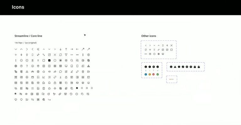
- Accessibility (WCAG): Universal design has been in focus from the first sketch. This includes better contrasts, readability and full keyboard navigation throughout the system.
The Most Important Changes in the User Experience
It is the small details that often make the biggest difference in the everyday life of a content producer. Here are the highlights from the new interface:
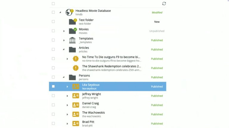
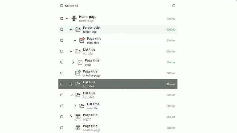
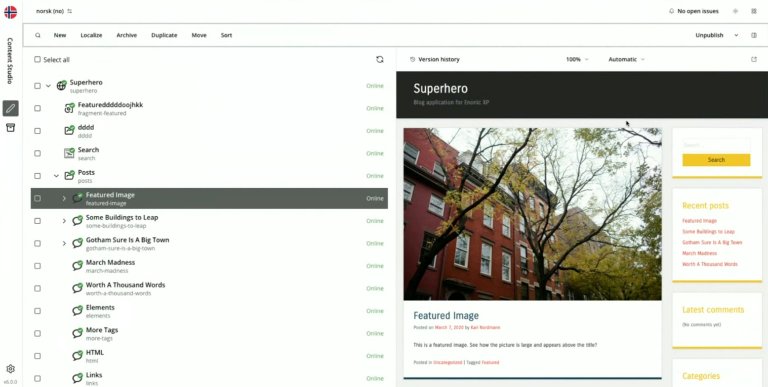
Easier Overview in the Tree Structure
In today's version, the status column can feel overwhelming, with icons for everything from changes to planned publishing. In version 6, this is simplified to four pure states for "online status": online, not online, expired or expiring. This makes it immediately clear to the editor what is actually visible to the public.
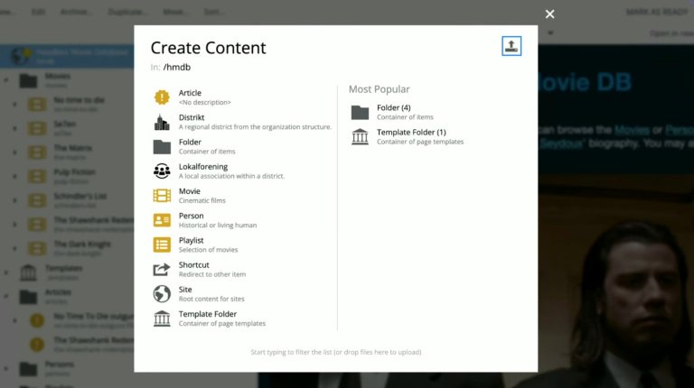
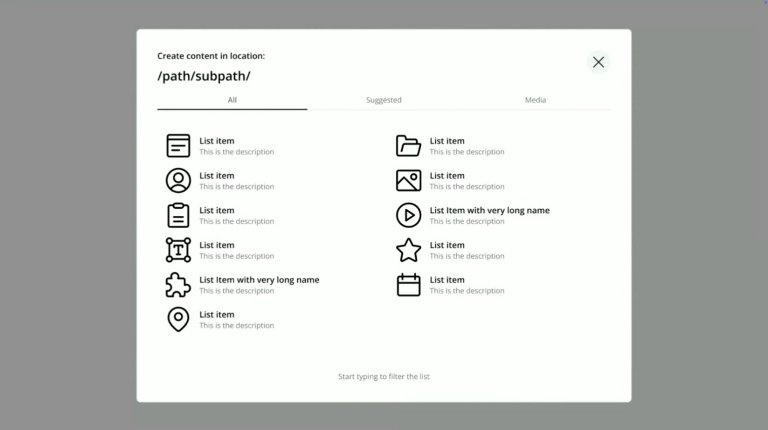
Focused Content Production
When you are going to create new content, the dialog box is now stripped of noise. The focus is only on what you are going to create there and then, with a clearer view of where in the structure the content is placed. Uploading files has been moved to a separate tab, which makes the function more visible to new users.
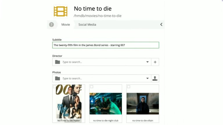
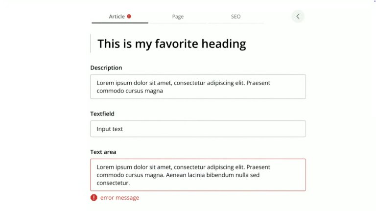
Intelligent Forms and Tabs
The classic scroll form has been replaced with tabs at the top. This removes the need for endless scrolling to find, for example, SEO settings. In addition, technical details such as icons and paths have been moved out of the main view to give more space to the title and content itself.
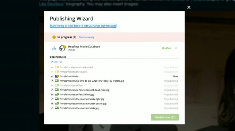
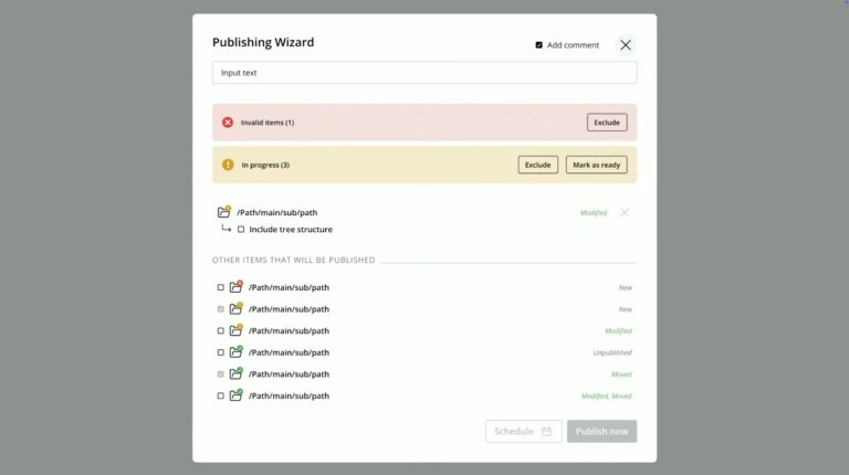
A More Transparent Publishing Wizard
Publishing is one of the most critical functions. The new wizard more clearly distinguishes between what has been changed and what is already out there. It also becomes easier to add comments and include underlying content (children) in the publishing process.
Technical Goodies and the Way Forward
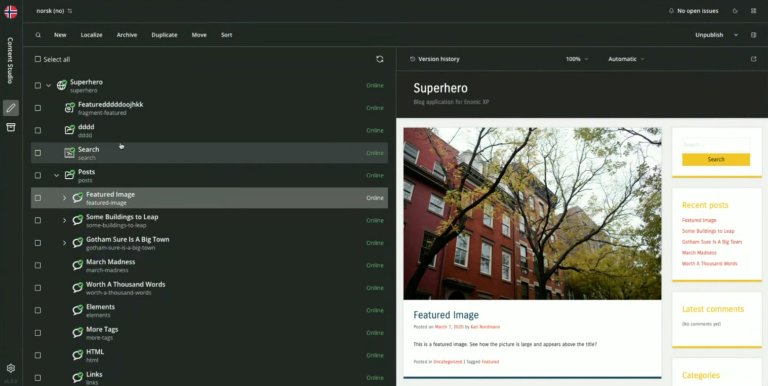
For those who prefer to work late, or who simply like the aesthetics, Content Studio 6 comes with support for Dark Mode. The system will automatically adapt to the device's settings and convert icons so that they remain clear in dark mode.
Another important change is the renaming of the well-known "Archive" button. User insight has shown that the term has been confusing, and in the new version it will simply be called "Delete". The logic behind it remains the same – the content ends up in a recycle bin – but the language becomes more direct and understandable.
When Is It Coming?
The goal is launch during the first quarter of 2026.
However, this is just the beginning. Thomas Sigdestad emphasizes that this foundation will make it possible to roll out even more long-awaited features in the future, such as improved search, favorite marking and more advanced time management of content.