Inside the New Enonic UI
See how we rebuilt our UI stack with React, Tailwind CSS, and Storybook, and learn how we consolidated design elements into a shared UI component library published on NPM.
Written by Vegard Ottervig on
For a decade, the Enonic Admin and Content Studio have been powered by a legacy tech stack that, while functional, increasingly struggled to keep up with modern developer expectations.
Alan Semenov, VP Engineering at Enonic, recently unveiled the future: Enonic UI. By leveraging AI, Preact, and Tailwind, the team is building a brand-new, accessible, and high-performance component library designed for the next generation of digital experiences.
10 Years of Technical Debt
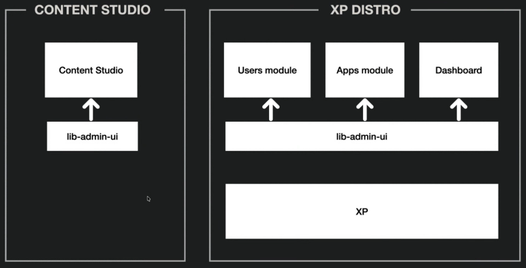
In what Alan Semenov jokingly calls "grandparents’ times" (otherwise known as 2015) the Enonic XP distribution was a tightly coupled package. Every time the team wanted to change a single button in Content Studio, they had to release a new version of the entire XP platform.
The engine under the hood was a library called libadmin.ui. While it got the job done, it carried the weight of 10 years of technical debt: jQuery, an outdated promise library, and styling selectors that were so complex they were nearly impossible to maintain.
The "Why" Behind the Overhaul
The decision to build Enonic UI wasn't just about "newness"; it was about solving these fundamental pain points:
- Architecture: The old library was tied to XP’s server-side logic. The new Enonic UI is a "pure" client-side library hosted on NPM.
- Modern Stack: Goodbye jQuery and manual DOM manipulation; hello modern state management.
- Simplicity: The old library was too complex for external developers to use. The new one aims for "stupidly simple," adoptable components.
- Styling Chaos: Legacy styles used deeply nested LESS selectors that often caused accidental visual bugs.
- Lack of Visibility: There was no way for developers to visualize components or see code examples… until now.
- Accessibility: Building for the modern web means baking WCAG standards into the core of every component.
- Market Demand: Customers wanted a fresher look, better performance, and the most requested feature of all: Dark Mode.
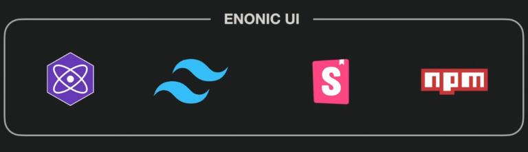
The Tech Stack: Built for 2026
To meet these requirements, the engineering team settled on a lean, high-performance stack:
- Preact: A lightweight alternative to React. It’s used during the current migration phase to keep individual component roots fast, with plans to transition fully to React later.
- Tailwind CSS: For isolated, maintainable styling that won't "leak" and break other elements when custom widgets are injected into the admin.
- Storybook: The new source of truth. It provides live visualization, documentation, and code examples for every state of every component.
- NPM: Making the library accessible to everyone, even those not building a full XP app.
AI: The Secret Member of the Team
Modern development at Enonic looks different than it did two years ago. Alan revealed that the team is building Enonic UI with a heavy assist from AI tools like Claude Code and Cursor.
Instead of just asking the AI to "write a button," the team has created a dedicated Rules folder in their repository.
These are set instructions: Guidelines on naming conventions, folder structures, and best practices, which the AI "conductor" follows to ensure every new component meets Enonic’s quality standards. This human-led, AI-executed approach has allowed the library to grow at an incredible pace.
The "Gradual" Migration Strategy
One of the biggest challenges was ensuring Content Studio 6 remained functional while being rebuilt piece by piece. The team created a Legacy Element wrapper. This allows the old TypeScript code and the new Preact components to live side-by-side in the same interface.
As the team builds new components (like the new Action Button), they simply overwrite the old ones. This "hot-swap" strategy ensures a stable transition without having to shut down development for months.
A Glimpse of the Future
In a live demo (see video above), Alan showcased the new Content Studio 6 interface. The results are a cleaner, more focused grid, a revamped details panel, and a significantly more intuitive publishing dialogue.
And yes, the crowd favorite was finally confirmed: Dark Mode is native and automatic, adapting to your system settings.
Release Timeline
Enonic UI, along with Content Studio 6 and XP8, is targeted for Q1 2026. While currently in a pre-release phase on NPM (with 45 versions already shipped!), the library is growing every week.