Sneak Peek: Content Studio 6
Content Studio is getting its biggest overhaul ever. Get the first look at the new design and functionality!
Written by Morten Eriksen on
After more than ten years of continuous use, Content Studio has reached a turning point. Content creators, editors, and developers now expect interfaces to be even more sleek, efficient, and intuitive.
To stay relevant, we needed a system that not only looked more modern but delivered a better user experience, smoother flow, and more efficient tooling.
The genesis of Content Studio 6 was in the works.
PS! The following information and screenshots are still work in progress and may be subject to change (as they say).
Why We Needed a Redesign
Over the past decade, features have been piled on, patches applied, and interfaces modified.
Meanwhile, new trends have emerged: dark mode, minimalist design, consistent iconography, and clearer typography. Users expect clarity over complexity.
Our internal development workflow and tooling was ripe for optimization. We decided on building a React UI component library which would span across all of our admin interfaces - including Content Studio. Published via NPM, this makes creating, maintaining, and releasing updates easier and faster.
All of the above motivated the redesign.
Our Process
We brought in an external designer, Jonas from the Enonic partner Item Consulting, who was already familiar with the platform. His pre-existing knowledge helped us hit the ground running: he understood our past, our users, and some of the development constraints.
This partnership also propelled access to user feedback. We have and will still focus on this user testing, interviewing both external users and in-house stakeholders.
Want to help? Join our test panel »
We have conducted workshops, prototype reviews, and interviews (including with Jonas) to clarify the work process, pain points, and opportunities.
As the designs matured, designers, developers, and product folks worked alongside each other. We broke down all our existing design elements, created task lists, and ran parts of the redesign in parallel. Design and implementation moves forward together.
Design Principles
Throughout, certain guiding principles shaped our decisions. We believe less is more. We also wanted to modernize without breaking things so badly that long-time users felt lost. We aimed for simplicity, clarity, consistency, and accessibility.
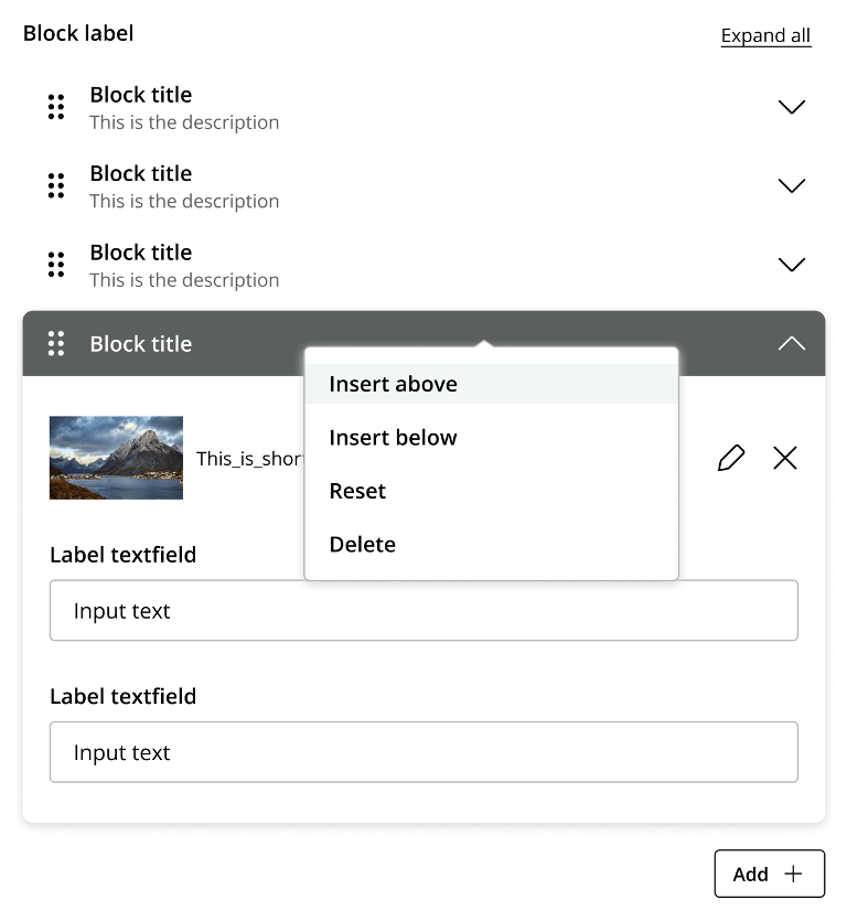
It boils down to clean typography, consistent icons, well-defined color and interaction rules. We’re adding full dark mode support, rounded corners, and a consistent drag-and-drop experience.
Our goal is a sleeker, faster, and more intuitive content authoring interface.
Key Visual and UX Changes
The typography has been refreshed to be sharper and more legible. Icons now have a more coherent style: uniform stroke weights, clearer semantics, less visual noise.
Light theme and dark theme both receive full support, ensuring that switching does not degrade usability or aesthetics.
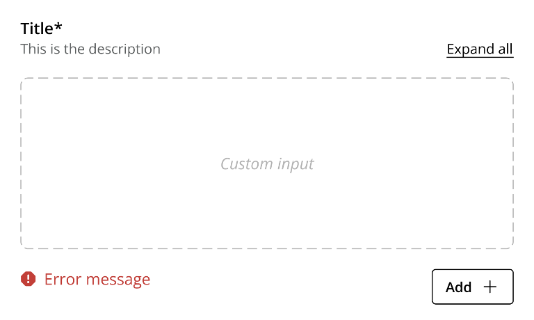
From a UX standpoint, we’re cleaning up the editing forms so that only the most relevant fields are shown by default, fields are grouped logically, and overall flow makes sense.
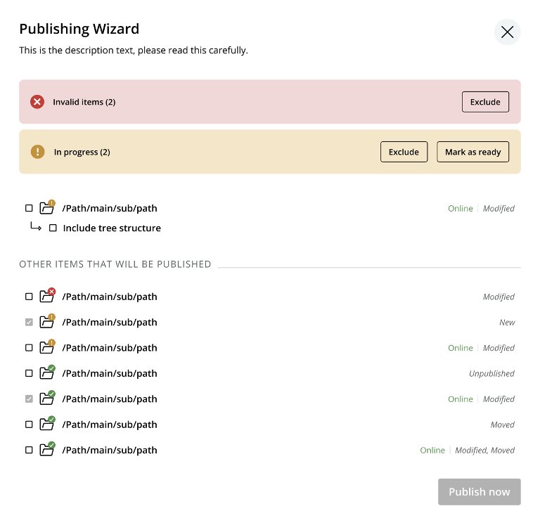
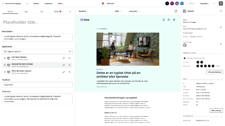
Publishing status versus content change status is now more intuitive: users can easily see what has been modified, what is pending, and what is online:
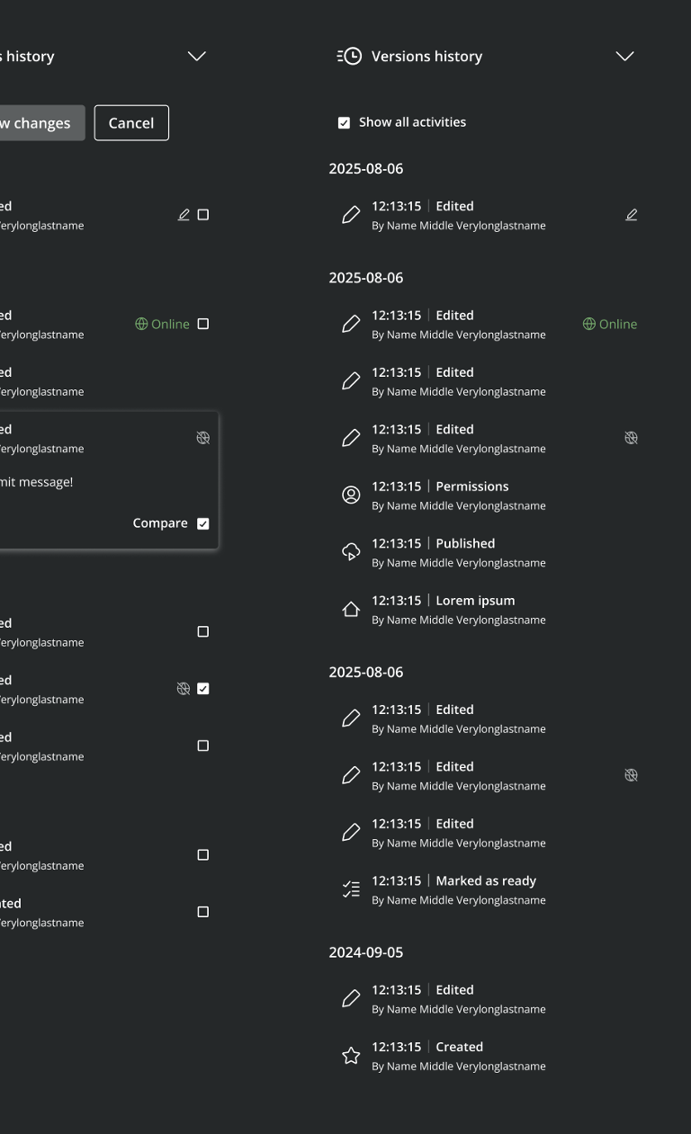
Version history gets more intuitive:
We’ve also redesigned the top-level “XP” menu so that navigation is more intuitive, reducing friction when moving between admin apps.
Implementation Details
Under the hood, we’ve overhauled the build and tooling environment. Enonic UI, our component library is published on NPM and React-ready. While this will form the backbone of Content Studio 6, it’s built to be used across all our admin interfaces.
We also adopted Storybook to catalogue components where one can browse all UI components, see their states, try code examples, and interact with them individually.
For styling, we’ve moved towards a system powered by Tailwind CSS, which gives us both flexibility and consistency, replacing or reducing reliance on older frameworks.
What Comes Next
We plan to launch the beta of Content Studio 6 together with XP 8 before Easter 2026. After launch, the work doesn’t stop.
We’ll continue refining based on user feedback, building more logic into our component library, and introducing more complex components as the need arises.
Our intention for Content Studio 6 is to set a foundation. Not to be perfect on day one, but to evolve smoothly and responsively.
You Can Help
Want to help improve the Content Studio experience? We invite you to join our test panel. Send us an email.