
How NAV Uses Content As Building Blocks
Complex. Unstructured. Maze. The user verdicts were merciless. With a well-thought-out content strategy and structured content in Enonic, NAV took steps toward a more user-friendly and predictable website.
Nav.no is often referred to as Norway's largest NAV office, with 230,000–240,000 daily visits. The website covers 164 financial benefits, services, and aids, and serves everything from unemployment benefits, job training, and parental leave to people in acute crisis.
The nav.no team is an interdisciplinary team of 15 developers, content specialists, and designers who manage the system, structure, navigation, and templates.
Challenge: Too Much Information
The front page and the information architecture on Nav.no met users as a 'wall of information.' The content was spread across many pages and organized according to internal considerations such as organizational structure and legislation rather than real user needs.
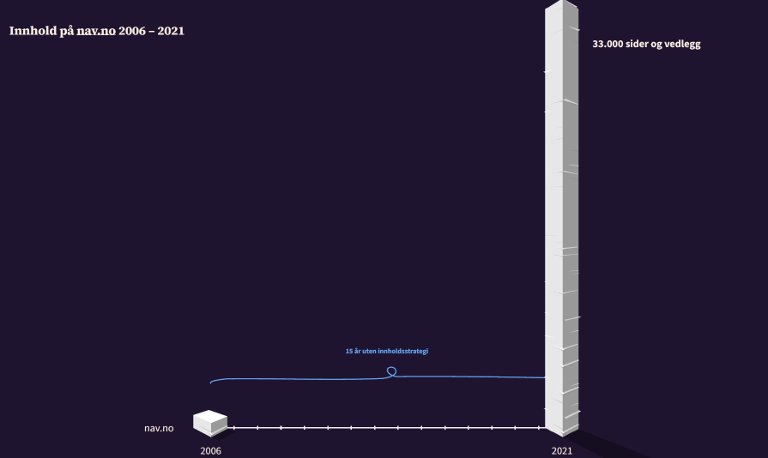
After many years without a holistic content strategy, nav.no had grown to approximately 33,000 pages and attachments by 2021. Services and financial benefits were consequently difficult to understand and find. If one searched for, for example, 'child support' (barnebidrag), one could get hits on 30 different pages.
Many users described the website as a 'labyrinth,' which created uncertainty and stress. This was particularly serious concerning questions about finances, housing, and subsistence.
Solution: Content as building blocks
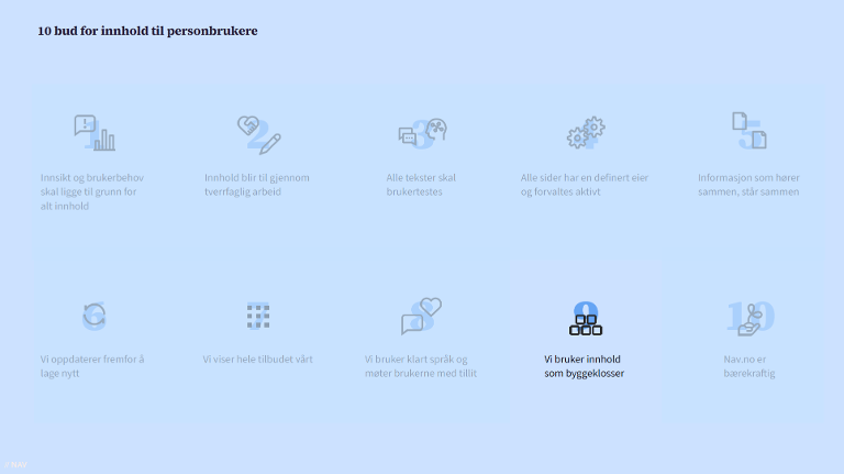
After 15 years, nav.no established a holistic content strategy, anchored in the open design system at aksel.nav.no. At the same time, they worked according to a clear principle formulated as commandment number nine: 'We use content as building blocks.'
The solution was developed on the Enonic platform and built on a flexible system of content types, templates, and reusable components.
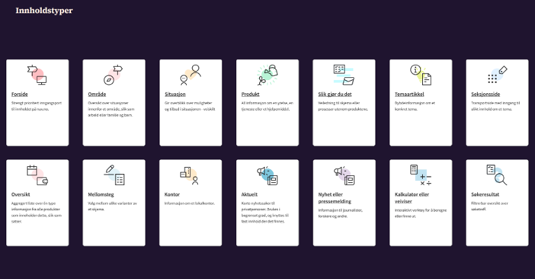
Content Types and Templates
Instead of forcing everything into one universal template, each content type—such as “product” and “situation”—was given its own purpose-built template.
This provided a more consistent and recognizable presentation of information across products such as retirement pension, parental benefits, and assistive devices.
The Building Block Principle in Enonic
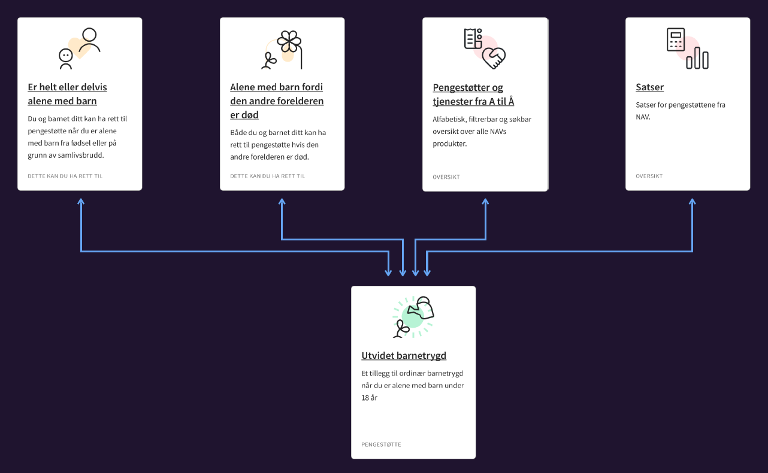
The very building block principle in Enonic involved a non-hierarchical navigation structure, where pages were detached from fixed folders and could instead be reused and placed wherever they were most relevant.
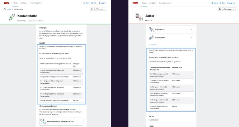
A product could therefore appear in several different situations or overviews. The content was structured as reusable components—such as rates, case processing times, payment dates, and application forms—managed in one place but displayed throughout the website.
Through metadata-driven display, information such as title, introduction, category, pictogram, and audience links is automatically retrieved to control cards, filtering, and page content.
Cleaning Up and Consolidation
Another important step was to clean up and consolidate information so that all product information is now found on a single page for each benefit or service.
This reduces the cognitive load for users and makes it easier to find the right information, both through navigation and search. Editors are supported by documentation in Aksel and e-learning resources.
Automation and Language
Finally, much of the maintenance was automated. Amounts and rates based on the National Insurance’s base amount are updated annually, ensuring that figures are always correct across the entire website.
In addition, Enonic’s language layers ensure that terms and values are handled seamlessly across multiple languages.