Guide to Content Studio

featureArticle.chapters
featureArticle.introduction
Content Studio is the interface for creating, managing, and publishing content on the headless Enonic platform. It supports both structured content, using forms and reusable content types, and visual page building with drag-and-drop components. It also includes tools for previewing changes, collaborating with others, and managing publishing workflows.
This guide covers Content Studio 6, which requires Enonic XP 8, and is intended for editors, marketers, content owners, and other contributors who create, edit, review, and publish content.
The content types, fields, page components, and widgets available to you may vary depending on your solution, including its content models, site setup, installed applications, your permissions, and front end.
For a quick overview, check out the Content Studio Cheat Sheet.
How to Use This Guide
- Read it end-to-end if you’re new.
- Jump straight to the task you need (create content, edit a page, publish, etc.).
- Use the tips in each section to avoid common mistakes.
Quick Glossary
- API: Intermediary that lets software applications talk to each other. Makes it possible to reuse your content and render it in any front end.
- Content Editor: The authoring workspace. It opens in a separate browser tab. Includes a preview/visual editor for pages/templates built from components.
- Content item: One piece of content (page, article, person, image, folder, etc.).
- Content Navigator: The default Workbench view for browsing, searching, previewing, and running actions on content.
- Content type: The “schema” describing fields and rules for a content item.
- Context Panel: Right-hand panel with widgets (Details, Version history, Dependencies, etc.) that adds capability.
- Draft: Your working copy (what you edit and preview in Content Studio).
- Front end: Templates and apps that can render your content. Typically also shown in Content Studio for preview and visual page editing.
- Layer: A project that inherits content from a “parent project” (often used for localization).
- Master: The published version (what end users can see online, subject to permissions).
- Online status: Whether an item is visible to the public: Online, Offline, Scheduled, or Expired.
- Project: An independent content repository in Content Studio.
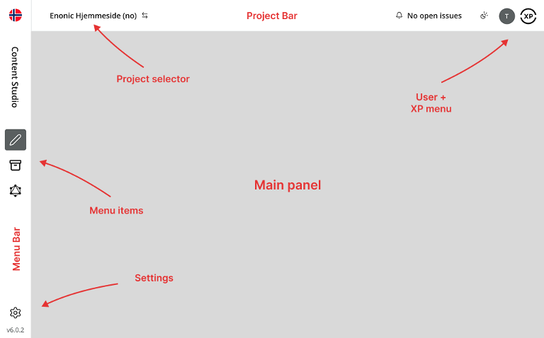
- Workbench: The Content Studio shell: project bar on top, menu on the left, and a main panel.
- Workflow state: Editorial readiness of the draft: Invalid, In progress, or Ready for publishing.
 authorBox.about
Morten Eriksen
Morten is the CEO and co-founder of Enonic. He has extensive experience as an entrepreneur focusing on areas like business development, product management, sales, and marketing. He started a digital agency in 1995 and built his first CMS in 1997, then founded Enonic in 2000 where his mission is to accelerate digital projects using innovative technology.
Chapter 1
Basics
Enonic is a headless CMS where developers build the site/app, and editors manage content through Content Studio. Content Studio focuses on:
- Structured content (forms and reusable content types)
- Visual editing (page building with components, where supported by your solution)
- Fast navigation and previewing
- Workflow (ready-for-publish, publish requests, scheduled publishing, etc.)
- Extensibility (widgets, integrations, and add-ons)
Workbench (Project Shell)
The main Content Studio interface, or project shell, is called the Workbench. It has a Project bar at the top, a vertical Menu bar on the left, and a Main panel. Use the Project bar to switch between projects and layers, and the Menu bar to access Content Navigator, Archive, and other available tools.
Settings is located on the bottom-left on the Menu bar. Here you can switch between Light theme, Dark theme, and System preference in the upper right. Here you can also change Site settings like language, display name, access mode, and roles.
Two Workspaces You’ll Use Every Day
This guide will mostly take place in the default Content Navigator workspace in the Menu bar. You’ll work primarily in two views:
- Content Navigator (also called Browse View):
- Browse the content tree, search, preview, and run actions like move, duplicate, sort, delete, and publish.
- Content Editor (also called Edit View):
- Create or edit an item in a separate browser tab. Edit its fields in the Content Form and observe the changes in the Preview Panel. For content with a page setup, arrange and configure components in the Preview Panel, or more correctly called the Page Editor in this instance. Visual editing depends on your solution’s front-end integration.
Each content item opens in its own editor tab, so you can keep several items open across projects and layers.
Both views provide access to a helpful tool:
- Context Panel (Widgets):
- A panel with tools like Details, Version history, Dependencies, and any additional widgets installed for your solution.
The Emulator is available in the preview toolbar and lets you check how content appears at different screen sizes.
Content-first
Even when you’re building pages visually, Content Studio is fundamentally content-first:
- All content items have types and fields
- Items can be referenced from other items (dependencies)
- The same content can be reused in many places (pages, lists, integrations, APIs)
This is why Content Studio is well suited to multi-channel delivery and headless setups: content is stored as structured data rather than locked into one page.
Chapter 2
Content Navigator
Content Navigator is your “home base” for browsing, organizing, and doing bulk operations. It is the default view in the Content Studio Workbench and shows content from the currently selected project or layer.
Main Layout
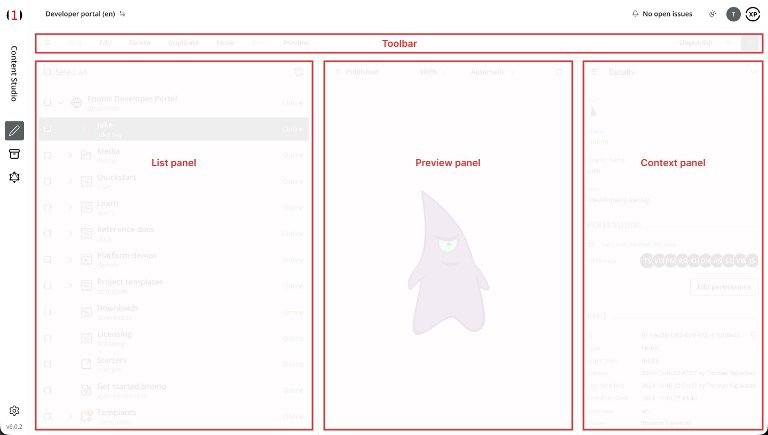
Below the actions toolbar, the Navigator layout consists of:
- Toolbar (available actions)
- Search Panel (toggleable)
- Content List/Tree/Grid (your content hierarchy)
- Preview Panel (interactive preview for supported content)
- Context Panel/Widgets (toggleable)
On smaller screens, Content Studio adjusts the layout and hides or collapses panels to make room for the current task.
Content Tree (the Grid)
The content list/tree/grid shows your content as a hierarchy. Common interactions:
- Expand/collapse items to show or hide children
- Select an item to preview it and see its details
- Use checkboxes to select multiple items for bulk actions
- Double-click an item to open it in a separate Content Editor browser tab
- Right-click to open a context menu with available actions
The content list shows identifying information and status indicators:
- Name: the content type icon, display name, and path
- Publishing state: Online, Offline, Scheduled, or Expired
- Workflow/validation indicator: an icon showing whether the draft is invalid, in progress, or ready for publishing. For published content with no unpublished changes, this icon is hidden.
- Layers indicator: identifies inherited or localized content when working in a layer
Publishing state is separate from change status. For example, an item can be Online while its draft is Modified. Change statuses such as New, Modified, Moved, Published, and Unpublished appear in the preview toolbar, Details panel, and Publishing Wizard.
Tip: In a layer, items whose content data is inherited and not localized appear with a visually subdued layer icon next to the publishing state, with a mouseover saying “Not localized.” Open the item and use Localize when you need to edit its content independently. An edited inherited content item have a layer icon with normal colorings, with mouseover saying “Localized.”
Actions Toolbar
The top toolbar is context-sensitive: available actions depend on your selection, the content’s state, and your permissions. Some actions may appear in a menu marked by an inverted chevron when space is limited. Common actions:
- New: create content under the selected parent, or at the project root when no parent is selected
- Edit: open the selected item in a separate Content Editor browser tab
- Delete: open the dialog for deleting content. Deleted items with descendants go to the Archive. Browsing and restoring items from the Archive is only available for paying customers.
- Duplicate: create a copy, optionally including children
- Move: move content and its children to a new parent location
- Sort: change the ordering of children under a parent
- Preview: open the selected content in a new browser tab
- Publishing/workflow dropdown: access actions such as Mark as ready, Publish, Publish tree, Unpublish, Request publishing, and Create issue
The main publishing/workflow button changes with the current context. For example, it may show Mark as ready for an item that is still in progress, or Request publishing when you lack publishing permission.
You can often do the same actions via the right-click context menu.
Bulk Actions
When selecting multiple items, remember:
- Bulk actions target the selected items; some actions are available only for a single item.
- The preview represents an individual item, not the complete selection. Check the selected checkboxes before running an action.
- Publishing can include required parent items and dependencies beyond your selection. Publish tree also includes descendants.
- Moving or deleting a parent can also affect its children.
Structuring the Content Hierarchy
There’s no one “correct” tree. Here are common patterns:
- By site section: /news, /about, /products, /support
- By content domain: /people, /locations, /press-releases
- By lifecycle: /year, /current-campaigns, /past-campaigns (editorial folders, separate from the system Archive)
A good structure should help editors:
- Find content quickly
- Understand what belongs where
- Maintain it over time (housekeeping)
Tip: Your content tree does not necessarily have to mirror your website navigation. Your front end can render content independently of how you store it.
Chapter 3
Search, Preview, and Context Panel
Search
Search is more than just finding content. You can use it to:
- Quickly locate a specific item
- Filter content by type, owner, language, and modification time
- Find and select content for bulk actions (publish, delete, move)
- Generate inventories by exporting search results
Common Search Filters
Use the free-text search to find content by ID, display name, or path. You can also narrow the results using these filters:
- Content type
- Workflow
- Last modified
- Last modified by
- Owner
- Language
The Last modified by and Owner filters include a Me option for quickly finding content you have edited or own.
Tip: Closing the Search Panel does not clear your search. The filters remain active until you clear them.
Export Search Results
When your search returns results, use the download icon beneath the search field to export them to a CSV file. The export contains basic metadata, such as ID, display name, and path. It does not include custom fields from your content types.
Preview
Previewing helps you catch mistakes before they go live:
- Check layout, spacing, and text flow
- Verify images and focal point behavior
- Click internal links to see if navigation works
- Review page components in context
In the Navigator, following an internal link in an interactive preview also selects the target content in the content list.
When Preview Is “Missing” or Looks Wrong
Common reasons:
- No available preview mode supports rendering the selected content
- Your site, template, or front-end integration is not configured to render it
- Required data is missing
- You are comparing a draft preview with a live version that does not yet include your changes (they are still unpublished)
If Automatic mode shows No preview available, you can still select JSON manually to inspect the content’s stored data.
Emulator and Mode
The Preview Panel includes an Emulator in its toolbar. Use it to check the preview at different screen sizes, such as:
- Desktop or monitor
- Mobile
- Tablet
The Preview Mode dropdown allows you to choose:
- Automatic: selects the first available preview mode that supports the content
- Media: displays images, videos, and other supported media
- Standard: renders content using the XP site service
- JSON: displays the content’s data in JSON format; available for all content, but not selected automatically as a fallback
- Custom preview modes: additional options supplied by applications installed for your solution
The preview toolbar also shows the item’s change status, such as New, Modified, or Published. Click this status to open Version history. Use the refresh control to reload the preview.
Tip: Use the Preview action in the Navigator or Content Editor toolbar to open the content in a separate browser tab. The new tab uses the preview mode selected in the panel.
Context Panel and Widgets
The Context Panel is available on the right-hand side of both Content Navigator and Content Editor. Use the toolbar toggle to show or hide it, and the panel selector to choose a widget. Widgets provide information and tools for the current content item.
- In Navigator, widgets, aka panels, give insight into selected items (details, versions, dependencies, etc.)
- In Editor, widgets provide the same tools and, where applicable, page-component settings
Built-in Widgets
These are some of the built-in widgets/panels you may use:
Details
Use Details to inspect information about the selected item, including:
- Content type, display name, and full path
- Change status, such as New, Modified, or Published
- Metadata (created/modified)
- Publishing schedule, where applicable
- Page template used, if any
- Attachments (downloadable binaries)
- User access and, when permitted, a shortcut to edit permissions
Version History
Version history records editorial changes and other activities for the content item. It lets you:
- Inspect previous versions and see who made changes and when
- Select two comparable entries and use Show changes to compare them
- Expand a restorable version and use Restore to make it the active draft
The panel shows editorial changes by default. Enable Show all activities to include events such as publishing, unpublishing, marking content as ready, and permission changes. Not every activity contains a version that can be restored.
Restoring an older version creates a new entry in the history and does not erase later versions. If the item is online, publish the restored draft when you want it to replace the live version.
Dependencies
Dependencies help you understand “what uses what.”
- Inbound dependencies: Other items that use this content
- Outbound dependencies: Items that this content uses
Dependencies matter for:
- Page components with explicit references to other content
- Internal content links
- Reused fragments or shared assets
- Shortcuts, featured content, or taxonomy references
Before deleting or unpublishing an item, check inbound dependencies and review any warnings to avoid breaking references.
Content Exports
Available to Content Administrators and System Administrators, the Content Exports panel lets you export and import content trees, including associated images and attachments.
This is different from exporting search results to CSV. Content exports contain the current draft content and are stored on the Enonic XP server. Transferring them between installations requires an administrator. They do not contain the project’s complete version or publishing history.
Workflow Tip
Before publishing important changes, use Version history to compare the current draft with the version that is online. This helps you verify exactly what you are about to publish.
Page Context Panel (in Page Editor)
When you’re editing pages or templates, select Page in the Context Panel to access:
- Insert tab: Add components to an editable page. Drag & drop into the preview is available when your front-end integration supports visual editing.
- Inspect tab: Configure the selected component or the page itself. Use Apply when shown to save configuration changes to the draft and refresh the preview.
The Insert tab is available when the content has its own editable page setup. If the page is still linked to a template, use Page settings to customize it before changing its component structure. Customizing creates an independent copy that no longer follows changes to the original template.
Pro Tip: Widgets and Integrations
Your team can extend the Context Panel with widgets for:
- Analytics dashboards
- SEO metadata checks
- Accessibility and quality tools
- Optimization/testing tools
- … and more
The available widgets depend on your installed applications, subscriptions, and permissions. These integrations let you access supporting tools directly inside Content Studio.
Chapter 4
Creating and Organizing Content
Content Types
Every content item you create or upload in Content Studio has a type, which defines its fields and behavior. Some types are built into Enonic, while others are supplied by applications available in your project or site.
Common Built-in Types
Folder
Folders group content in the hierarchy. They have no content-specific data fields, but still have a display name, path, permissions, and other standard content properties.
Shortcut
Shortcuts create a path that redirects to another content item. They’re commonly used to create short URLs for content that lives deeper in the hierarchy, or to redirect a deleted or moved content path to an online item.
Site
A site item usually represents a website and is created at the project root. It holds a description, an optional Base URL, and application configuration. Applications assigned to the site determine which content types, mixins, and page components are available within it. A Templates folder is created automatically beneath the site.
Page Templates
Page templates contain reusable page structures and component configuration. They must be stored in the site’s Templates folder and can support one or more content types. Your front-end integration determines how templates are used to render content.
Media
Uploading a file creates a media content item, such as an image, video, audio file, or document. Content Studio detects the appropriate type from the uploaded file.
Image
Images are media content items with image-specific metadata and editing tools, including cropping and focal point adjustment.
Fragment
A fragment stores a reusable page component as a separate content item. Use fragments for shared page elements that you want to maintain centrally and reuse across multiple pages.
Note: Your solution will likely have custom content types such as Article, Landing Page, Product, Person, Case Study, or Recipe.
Create Content
Here are three common ways to create a content item in Content Studio:
- Toolbar: New
- Keyboard: Alt + N
- Right-click in the tree/grid: New
Choose Location
Where you create content matters. Before clicking New:
- Select the folder or parent item where it belongs
- Confirm you’re in the correct project using the project bar
- Confirm you’re in the correct layer/language, if applicable
If no item is selected, new content is created at the project root.
Choose Type
The New Content dialog shows the content types available in the current context. You can:
- Browse the available types
- Filter the available types by typing
- Use Suggested to see the types most frequently used at the selected location
Selecting a type creates a new item and opens it in a separate Content Editor browser tab.
Upload Files
To create media content, use the Media tab in the New Content dialog or drag files onto the dialog. You can upload multiple files at once.
Duplicate Content
Duplicating is ideal for:
- Recurring landing pages
- Campaign pages
- Repeatable article formats
- Creating “starter” structures for editors
When duplicating:
- Use the checkbox in the Duplicate dialog to include child items, such as a folder’s contents
- Review the copy’s display name and path name, and rename them as needed
- Verify that references to images, fragments, and other content still make sense
Copies receive new content IDs. Their path names get a suffix such as -copy, -copy-2, or -copy-3.
Move Content
Moving content changes its position in the tree. Depending on your routing/setup, it may also change URLs. Check the impact on navigation and external links before moving published content.
Typical move flow:
- Select one or more items
- Choose Move
- Search or browse for the new parent, or choose Project root
- Confirm the move
Good to Know
- Move carries all children and current permissions with it. Review access after moving content to a different section.
- When you move content in Content Navigator, the completion notification includes the new path.
- A moved published item stays live at its old location until the move is published.
Sort Content
Select a parent item and choose Sort to control the order of its children. You can sort by:
- Modified date
- Created date
- Display name
- Publish date
- Manual drag & drop within the Sort dialog
The default order is Modified date, newest first. For automatic sorting, choose ascending or descending order. For manual sorting, drag the rows into the desired order and save.
Note: a sort change is a draft change and must be published.
When Sorting Matters
- Navigation menus driven from the tree
- “Featured” lists stored as children
- Editorial prioritization (top content first)
The order affects the Navigator and applications that use the configured child order. Your website may use its own sorting rules, so check the result in preview.
Delete Content
The Delete action in the Navigator or Content Editor moves the selected content and all its descendants to the Archive. Published items are taken offline immediately as part of the operation.
The archive preserves the content for later restoration. Permanent deletion is a separate action in the Archive view and removes the content, its attachments, and its stored version history. It cannot be undone through Content Studio.
Key principle: check references before removing content. If an item is referenced by content outside the selection, the Delete dialog displays a warning and blocks the action until the references are resolved or explicitly ignored.
Before deleting:
- Open the Dependencies widget/panel
- Check inbound dependencies (“what uses this?”)
- Remove or replace references as needed, and save those changes
- Review the complete list of affected items, including descendants, in the Delete dialog
Tip: Use Show references in the Delete dialog to inspect affected references. Choosing Ignore inbound references allows the operation to continue but leaves those references pointing to unavailable content.
Restoring Archived Content
Archiving is available in all Content Studio installations. The Archive browser, including its Restore and permanent Delete actions, requires Content Studio+.
Restoring an item also restores its descendants. Content returns to its original location when possible, or to the project root if that location is no longer available.
Chapter 5
Editing Content
Content Editor
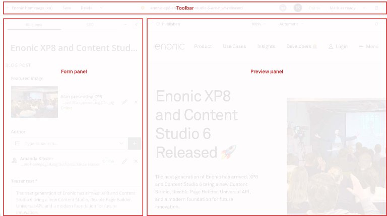
When you edit a content item, you typically see:
- Content Form (fields on the left)
- Preview/Page Editor (on the right, depending on content type)
- Toolbar Actions like Save, Delete, Duplicate, Move, Publish (context-dependent)
- Widgets via the right-hand Context Panel
Saving Habits That Reduce Mistakes
- Save early and often (especially before switching to another tab)
- Use preview after major changes
- If you’re about to publish: validate content, check dependencies, and check the right project/layer
Validation and Readiness
Many content types have required fields. Content may be:
- Incomplete (missing required fields)
- Valid but still “in progress”
- Ready for publishing
Publishing is blocked until content is valid and ready, or you exclude non-required items in publishing (if allowed).
Content Form
The Content Form is on the left side of the Page Editor. It can be collapsed and expanded. Some content types feature a simple form with few fields, while others can be complex.
Depending on the content type, populating the fields of the Content Form and saving will update the Page Preview accordingly. For example, if you fill in the title, intro, image, author, and body text of a news article, the preview will show these contents.
Other content types, like e.g. a landing page, may have few fields in the Content Form and instead focus on editing components directly in the Page Editor (more on this later).
The Content Form has at least one tab called “[Content Type]” and shows the fields unique to the specific content type.
If a content type has a page configuration, there is a second tab called “Page,” which displays an overview of the item’s components in a tree structure. Additional tabs can be added to the form through mixins, with fields that can further enrich the content. Some examples are “Menu” and “SEO”.
Component Tree
The tab “Page” reveals a schematic overview of all components on any given content item. This is especially useful on long and complex pages. Some content types will have few, others will have many.
The component tree shows where the components are placed in relation to each other, and what kind of components they are. Here you can drag and drop, as well as select parent component, insert a new one, inspect, reset, remove, duplicate, and save as fragment.
More on the Component Tree under “Building Pages” below.
Rich Text Editor
Some content types have rich text editor fields (HtmlArea). These are used for things like:
- Article body content
- Text components on landing pages
- Introductions, teasers, and formatted sections
Practical Ways to Work Faster
- Use familiar shortcuts (save, undo/redo, etc.)
- Use “paste as text” to avoid messy formatting from Word/Google Docs
- Use headings consistently (H2 → H3, avoid skipping)
- Prefer internal content links when linking to other content in the same solution
Images Inside Rich Text
Many setups support drag & drop images into the rich text editor. Alternatively insert images from the rich text toolbar (or use CTRL + L).
When uploading an image in the rich text editor, the image dialog requires you to choose between “Decorative image” and “Alternative text” for accessibility purposes.
Always:
- Set meaningful alt text (if you have chosen “Alternative text”)
- Leave width unspecified, but use style and alignment
- Confirm how images render on mobile via preview/emulator
Macros and Embedded Content
Macros are instructions that enrich your rich text field with additional content or functionality. There are two built in macros in Content Studio: “Embed iframe” and “Disable macros.” Your developers can configure custom macros, e.g. allowing you to insert:
- Videos
- Social embeds
- Special callouts
- Custom components inside text
Macros are powerful. Use them for consistent formatting and brand compliance.
Image Handling
You can upload images in both Content Navigator (through the Create content dialog) and Content Editor (through an image field or a rich text editor if applicable).
If you have the AI Juke Content Operator (see below) installed and assigned to a project or site, all images uploaded therein will receive an automatic alt text. This will be in the content's language and in compliance with the WCAG guidelines for text alternatives. Existing alt text is not overwritten.
Uploading an image creates an image content item with metadata like caption, credits, and technical EXIF. You can edit images by:
- Cropping
- Rotating
- Flipping (mirroring)
You can always undo these changes by selecting “Reset.” One final action is Focal Point (also known as Autofocus):
Focal Point
If the same image is used in multiple aspect ratios (cards, hero banners, etc.), focal point helps keep the important part visible at all times.
Typical focal point workflow:
- Open the image content item
- Activate focal point (icon)
- Click the point that must stay in frame (e.g., a face)
- Apply and save
Chapter 6
AI Capabilities
Juke AI Content Operator
Juke AI is an app for paying customers. It brings generative AI support into Content Studio.
How You Access Juke AI
The Juke AI Content Operator app must first be installed. Then the app must be added to the project or the site that contains the content. Now you can open the Juke chat interface by clicking the Juke icon in the Content Editor toolbar.
Custom Instructions
You can add general instructions at a project or site level for tone of voice, dictionary, brand compliance, and more.
Field Context: Focus AI on the Right Place
Juke can use a specific field as “context.” Supported fields typically include text-based fields like:
- TextLine
- TextArea
- HtmlArea
Mentions: Target Fields Directly in Prompts
Inside the chat input, type `@` to list fields you can reference, then ask Juke to:
- Suggest improved copy
- Create multiple variants
- Generate a display name based on body content
- Expand or restructure text
Insert Responses Into Fields
Juke can return field value suggestions. Use:
- Insert to put the generated text into the relevant field
- Insert all (when multiple fields are returned)
- Copy to paste manually
Known Limitations
Juke AI currently has limitations such as:
- Works primarily with text fields in the Content Form
- Does not support fields in mixins or pages
- Only available in Content Editor context
Juke AI Content Translator
Juke AI Content Translator is another add-on app for paying customers. It helps you translate content inside Content Studio, with a primary focus on localization workflows.

How You Access Juke AI Content Translator
The Juke AI Content Translator app must first be installed. It must also be added to the project or site where the content resides. Once installed and applied, translation becomes available through:
- Layer localization: When you localize inherited content in a layer, Content Studio prompts you to translate to the layer language with Juke’s help.
- Language change: When you change the language of existing content in a regular project, Content Studio suggests translating the text fields to the new language.
Translate When Localizing in a Layer
When working in a layer, you open inherited items in Content Navigator by clicking Edit. This opens the inherited item in a read-only mode in Content Editor. If Juke AI Content Translator is enabled, clicking Localize will open a translation dialog where you can translate the content to the layer language.
- Select an inherited content item in the layer and click Edit
- Click Localize
- In the translation dialog, optionally add instructions (or keep defaults)
- Click Translate to translate all text fields
- Review the results, then save and publish in the layer when ready
Translate When Changing Language on Existing Content
If your solution uses language on content items (outside layering), Content Studio can also offer translation when you change the language of an existing item:
- Open a content item in the Content Editor
- Change the item’s language in the Context Panel
- If the item has text fields, Content Studio suggests translating all text fields to the new language
What Gets Translated
Translation targets text-based fields in the Content Form. This typically includes fields like:
- TextLine
- TextArea
- HtmlArea (rich text)
The translator works across schemas and content types and translates relevant text fields in localized content.
Custom Instructions: Keep Translations Consistent
You can fine-tune translations by providing general translator instructions at a project or site level (for example a custom dictionary, preferred terminology, or brand tone). You can also override these instructions per translation when localizing a specific content item.
Review and Apply Translation
AI translation is meant to speed up localization, not replace editorial review. After translation:
- Read through translated fields for accuracy, terminology, and tone
- Check formatting (especially in rich text)
- Verify links, product names, and proper nouns
- Save the content and publish (or create a publish request) when ready
Known Limitations
- Requires a valid Enonic subscription, and the translator app installed and assigned.
- Translation is offered only in specific UI flows (layer localization, and language change in Content Editor).
- Works on text fields; non-text content (like images/files) is not “translated.”
- Always review output—AI can produce incorrect wording or inconsistent terminology without good instructions.
Chapter 7
Building Pages
This section is about the Page Editor: how to build pages using components (layouts, parts, and fragments). Available components come from applications assigned to your site. Visual editing in the preview depends on your solution’s front-end integration.
Templates vs. Customizing a Page
Many solutions work like this:
- A content type (e.g., Article) is rendered using a page template
- The template gives you a consistent structure of components
- For landing pages (and sometimes other types), editors may customize the page and build with components
In Page Settings in the Context Panel, you can use automatic template selection or select a specific compatible template for your content type. Selecting a template keeps the page linked to it and any changes that may be performed on it.
Developers can turn on the ability to Automatically Customize a content item of a given type. This speeds up the process for editors who create e.g. landing pages. Now they can immediately drag and drop components from the Context Panel into the Page Editor and start building.
Content types like landing pages may use an ‘empty’ template so you can build from scratch when you customize it (i.e. detach it from the template).
PS: Your developers can turn off the feature that sets automatic customization as default. This inserts a few manual steps into the process if that is desirable.
Components
Components are the building blocks of a page. They can display content from the form or have their own configuration. The root Page component defines the overall structure, including regions where other components can be placed.
There are three types of components:
- Part
- Layout
- Fragment
Part
Parts are configurable components with specific functions. Examples:
- Article lists
- Employee listings
- Contact forms
- Banners, buttons, or cards
- Dynamic elements pulling in content
- Rich text sections
Parts usually have configuration fields in the Inspect tab of the right-hand Context Panel.
Layout
A layout is a container with regions that hold other components. Layouts cannot be nested inside other layouts.
Depending on the layouts supplied by your application, use them for:
- Multi-column sections
- Structured blocks (hero + text + CTA)
- Consistent spacing and alignment
- Custom background colors and spacing/margins
Fragment
Fragments are reusable component structures. You create a fragment by:
- Selecting a component, such as a Part or Layout, on an editable page
- Opening its context menu and choosing Save as Fragment
This creates a Fragment content item beneath the current item and replaces the original component with a reference to it.
Use fragments for:
- Recurring sections (newsletter signup, contact info)
- Shared disclaimers/legal blocks
- Campaign modules reused across pages
A typical fragment workflow:
- Build a section once
- Save it as a fragment
- Insert a Fragment component on another page and choose the saved fragment in the Inspect tab
Fragment edits update its draft. Publish the fragment to make those changes available to published pages that reference it; those pages do not each need republishing. Check inbound dependencies before changing widely reused fragments.
Use Detach from Fragment to replace a reference with an independent copy of the components on that page. Later fragment changes will no longer affect the now detached components.
Page Widget
Select Page in the right-hand Context Panel to access:
- Insert: Add components to an editable page; drag & drop into the preview when supported
- Inspect: Edit settings for the selected component or the page itself
Page-structure operations save automatically to the draft. Use Apply when shown to save configuration changes. Neither operation publishes the page.
Example of Landing Page Workflow
- Create the landing page content item
- Complete its fields, including Display Name, and save
- Open Page settings from the Context Panel or the locked preview’s menu
- For a template-based page, click Customize and confirm; otherwise select a Page component
- Insert a Layout if needed
- Add an application-provided rich-text Part for text sections
- Add other Parts (e.g., hero banner, CTA, latest articles)
- Insert a Fragment for shared sections (e.g., signup)
- Apply configuration changes, resolve validation errors, and check the page using preview/emulator
- Publish or request publishing, reviewing dependencies in the publishing flow
Component Tree
The Component Tree is located in the Page tab of the Content Form. It shows the Page root, regions, and components. Selecting a component opens its configuration.
On long or complex pages, the tree helps you:
- See structure at a glance
- Select hard-to-click or empty components
- Reorganize components by dragging them between compatible positions
- Access component actions through the context menu
Use it when the page becomes difficult to manage by clicking in the preview, or when interactive visual editing is unavailable.
Chapter 8
Publishing Content
Publishing is where drafts become live content, subject to their permissions and publishing schedule.
Draft and Master Branches
You edit content in the Draft branch. Publishing copies the active draft version to the Master branch.
Content Studio distinguishes between publishing state (whether content is live), change status (how the draft differs from the published version), and workflow state (whether the work is ready).
A simplified lifecycle for a new item published immediately:
| Action | Publishing State | Change Status | Workflow/Validation Indicator |
|---|---|---|---|
| Create content | Offline | New | In progress, or Invalid if validation fails |
| Complete required fields and save | Offline | New | In progress |
| Mark as ready | Offline | New | Ready for publishing |
| Publish | Online | Published | Hidden when there are no unpublished changes |
| Edit and save published content | Online | Modified | In progress, or Invalid if validation fails |
Invalid indicates a validation problem rather than a separate stored workflow state. You can save an invalid draft, but it cannot be marked ready or published.
Editing and saving published content will not affect the live version until you publish the changes. An item can therefore remain Online while its draft is Modified and In progress.
Exception: Permission changes take effect immediately in both Draft and Master without republishing.
Publishing Actions
Common publish-related actions include:
- Mark as ready (when valid content is in progress)
- Publish
- Publish tree (includes the selected content, descendants, and dependencies)
- Unpublish
- Request publishing (when you lack permission or want another person’s approval)
- Create issue (collaboration/issues; creating a task does not change publishing or workflow state)
Publishing Wizard
Choosing Mark as ready (for content in progress) or Publish (for content marked as ready) opens the Publishing Wizard. This dialog:
- Lists the selected content and relevant dependencies
- Includes required ancestors
- Checks validity, readiness, and permissions
- Lets you review the batch before confirming publication
- “Add comment” which records a comment in the version history
When publishing from the Content Editor, a user with editing and publishing permission can invoke Publish on an in-progress item. The user is then prompted to mark the content as ready before publishing.
Managing Dependencies and Child Items
In the wizard you can:
- Include/exclude optional dependencies and confirm the selection with Apply
- Include/exclude child items
- Mark in-progress items ready in bulk, if this feature is enabled
- Use Show excluded to restore excluded items
All mandatory dependencies are included automatically by default. Optional dependencies are listed, but are unchecked unless an administrator changes the setting.
Required items cannot be excluded. Resolve validation or readiness problems before publishing; use Request publishing if you lack the necessary permissions.
Always make sure to review the batch, including its parents and dependencies, before publishing.
Scheduled Publishing
Use the Schedule button in the Publishing Wizard to set Online from and, optionally, Online to. The confirmation button changes to Schedule.
Online from defaults to Now. Choose a future date and time for a delayed launch.
Use scheduling for:
- Campaign launches
- Timed announcements
- Content that must expire automatically
Scheduling applies only to currently offline items. Changes to already-online items in the same batch are published immediately.
The publishing state shows Scheduled before a future launch and Expired after the configured end time has passed.
Unpublish
Unpublish removes content from the Master branch and takes it offline. It leaves the draft available for editing and later re-publication.
- Descendants are included in the operation; review the full list before proceeding.
- Published inbound references trigger a warning and disable the action until resolved or explicitly ignored.
- The dialog asks you to enter the total number of items to confirm unpublishing (this only applies to multiple items).
Use Show references to find content that depends on the selected items. Remove or replace those references and publish the referring content’s changes before continuing.
Ignore inbound references allows you to proceed anyway, but can leave published content pointing to unavailable items.
Chapter 9
Projects, Layers, and Extensions
Projects
Projects let you organize content into separate repositories for teams, sites, or initiatives. Each project has:
- Its own project roles, permissions, and access settings
- A default language
- Applications that provide content types and other CMS features
- Separate Draft and Master branches for editing and publishing
The current project is visible in the project bar. Use the project selector to switch between projects and layers you can access.
A project’s access mode can be Public, Private, or Custom. This controls default read access to published content. Choosing Public does not expose unpublished drafts.
Project applications supply features for content outside sites. Applications needed within a site must also be assigned directly to that site. Layers inherit their parent project’s applications and can have additional applications of their own.
Project Management (Admins)
Projects and layers are managed under Settings at the bottom-left of the Workbench. Settings is not limited to the currently selected project. Depending on your roles, you may be able to:
- Create projects and layers
- Configure the default language and access mode
- Assign project roles to users and groups
- Configure project applications
- Delete projects
A project’s identifier and parent project cannot be changed after creation. Changing its default language affects newly created content, not the language of existing items.
Important: Deleting a project removes its repository and all its data. This cannot be undone through Content Studio.
Layers
Layers let you reuse and adapt content across languages, regions, brands, or channels:
- A layer is a project that inherits content from a parent project.
- Inherited content can be localized, renamed, moved, sorted, and deleted independently.
- Inheritance updates the layer’s draft; publishing is handled separately in each layer.
Inheritance is tracked separately for content data, path name, parent location, and child sort order. Changing one does not stop the others from inheriting. For example, a localized item may still inherit its name and location.
Inherited content appears with a visually subdued layer indicator next to the publishing status in the Navigator. Inherited and localized content receives a normally colored indicator. Clicking it provides access to the Layers widget/panel in the Context Panel when available.
Localizing an Item
A typical localization flow:
- Open the inherited item in the intended layer
- Click Localize to enable editing and assign the layer’s default language
- Edit and save the localized content
- Publish in that layer when ready
After an item is first marked Ready in its parent, subsequent content updates propagate when marked Ready.
Reset restores inheritance for all locally changed dimensions, replacing local content, name, location, and sorting with the parent’s values.
Content Studio+

Content Studio+ is a companion application that requires a valid Enonic subscription. Its advanced capabilities include:
- Layers Panel (inspect localization and publishing status across layers, and open the corresponding item in another accessible layer)
- Archive Browser (browse, restore, and permanently delete archived content)
- Variants (create and manage related content alternatives that can be edited and published independently)
- Publishing Report (compare published versions over a selected period and review when content was online or offline)
Deleting content is available without Content Studio+, but the dedicated Archive browser and its restore and permanent-delete actions require the subscription.
Variants can support A/B testing, but an external testing or delivery system must serve the alternatives and measure results. Content Studio does not run the test or select a winner.
Juke AI skills also require a valid subscription and their respective applications. For example, the Content Translator can assist when localizing content; see the AI chapter for details.
Available features depend on the installed applications, a valid license, and your permissions. Installing Content Studio+ without a valid license does not activate its interface features.
Integrations and Custom Widgets
Beyond built-in widgets, Content Studio can be extended with:
- Custom widgets built for your solution
- Widgets installed via applications
- Dashboards and tools for analytics, SEO, accessibility, and optimization
- Custom preview modes for your content
- Additional views in the Workbench’s left-hand menu
Check with your Enonic team to see which widgets and integrations are available in your solution.
Chapter 10
Issues and Permissions
Issues
Issues are Content Studio’s built-in collaboration feature for tasks and publish requests. Open them from the issues indicator in the Workbench’s upper right project bar. Use issues to:
- Ask for proofreading/review
- Request missing assets (images, data)
- Coordinate publishing with colleagues
- Track what needs to happen before something goes live
An issue includes:
- A title, description, and comments
- Related content items
- Assignees
- An Open or Closed status
- A chat or comment section
Use the issue list to switch between open and closed issues and filter by assignment, creator, or issue type.
To create an issue for specific content, select the items in the Navigator and choose Create Issue from the toolbar menu. The selected items are added to the issue.
An issue tracks editorial work. Attaching content to an issue or closing the issue does not mark the content ready or publish it.
Publish Requests
A publish request asks another user to review and publish content. Use it when you lack publishing permission or want another person’s approval before publication.
To create a request:
- Have your relevant content item open in Content Editor
- Choose the More actions (inverted chevron) next to Mark as ready/Publish
- Choose Request publishing from the dropdown menu
- Review the selected items and dependencies
- Describe the changes and select the reviewer or reviewers
- Click Create request
A reviewer with the required permissions can publish or schedule publication from the Issues menu and the relevant Request publishing issue. If the content belongs to an open request, the Content Editor may show Open request as its main action.
Note: a publish request closes automatically after a successful publish.
Permissions
Permissions in Content Studio are based on:
- Principals (users, groups, and roles)
- Per-content permissions (Read, Create, Modify, Delete, Publish, and Permissions)
- Initial permissions copied from the parent item, or from project defaults for items created at the project root
Existing children do not automatically receive later permission changes made to their parent. Apply changes to children explicitly when needed.
Best Practice: Manage Permissions with Groups and Roles
Use groups and roles to simplify access management. Project roles provide different default capabilities:
- Contributor: view content
- Author: create, edit, and delete content
- Editor: also publish content and change content permissions
- Owner: also create/configure sites and manage project settings
Check the item’s permissions when someone cannot perform an action, since permissions can differ between items.
Editing Permissions
Open Details and choose Edit permissions. You need the “Permissions” permission, included in Full Access.
- Add or remove principals and adjust their access levels
- Choose whether changes affect this item, its children, or both
- Review the summary and apply the changes
By default, applying changes to children preserves their unrelated permissions. Replace all child permissions replaces their existing settings completely.
Permission changes affect Draft and Master immediately. Republishing is unnecessary.
Public Content Requires Public Access and Publication
For anonymous visitors to access content, it must:
- Be published and currently online
- Have Public access, which grants the Everyone role Read permission
Public project access does not expose unpublished drafts.
Practical Editorial Workflow
Here’s a workflow many teams use:
- An Author drafts content (In progress)
- The Author creates a task for review (proofreading, SEO, etc.)
- A reviewer adds comments and requests changes through the task
- The Author completes the changes, resolves validation errors, and marks the content ready
- The Author creates a publish request for an Editor or another user with publishing permission
- The Publisher reviews the content and dependencies, then publishes or schedules publication
- The team closes completed editorial tasks and monitors performance through available widgets/integrations
Chapter 11
Appendix: Keyboard Shortcuts
This section describes the shortcuts that are available for content editors in Content Studio.
Tip: Press F2 inside a view to reveal all available shortcuts for that view.
Content Navigator/Browse View
| Content Navigator | macOS | Windows / Linux |
|---|---|---|
New content |
| |
Select / Unselect content |
| |
Move selected content |
| |
Edit selected content |
|
|
Archive selected content |
|
|
Publish selected content |
|
|
Preview selected content |
|
|
Open search panel |
| |
Content Editor/Edit View
| Content Editor | macOS | Windows / Linux |
|---|---|---|
Save content |
|
|
Save content and close tab |
|
|
Close tab |
| |
Archive content |
|
|
Publish selected content |
|
|
Preview selected content |
|
|
Rich Text Editor
Available formatting shortcuts depend on the tools and heading levels enabled for the HtmlArea field.
| HtmlArea editor | macOS | Windows / Linux |
|---|---|---|
Cut |
|
|
Copy |
|
|
Paste |
|
|
Paste as text |
|
|
Select All |
|
|
Bold |
|
|
Italic |
|
|
Underline |
|
|
H1 |
|
|
H2 |
|
|
H3 |
|
|
H4 |
|
|
H5 |
|
|
H6 |
|
|
Paragraph |
|
|
Div (Normal) |
|
|
Address |
|
|
Undo |
|
|
Redo |
|
|
Insert link |
|
|
Insert image |
|
|
Find |
|
|
Replace |
|
|
Focus to toolbar |
| |
Focus to element |
| |
Insert non-breaking space |
| |